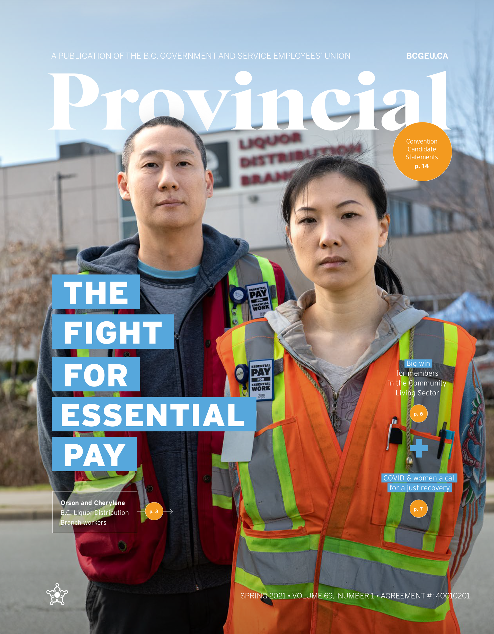
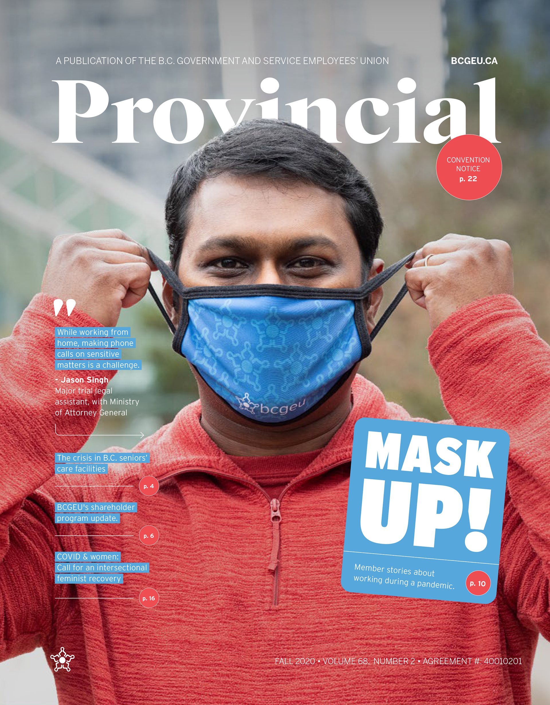
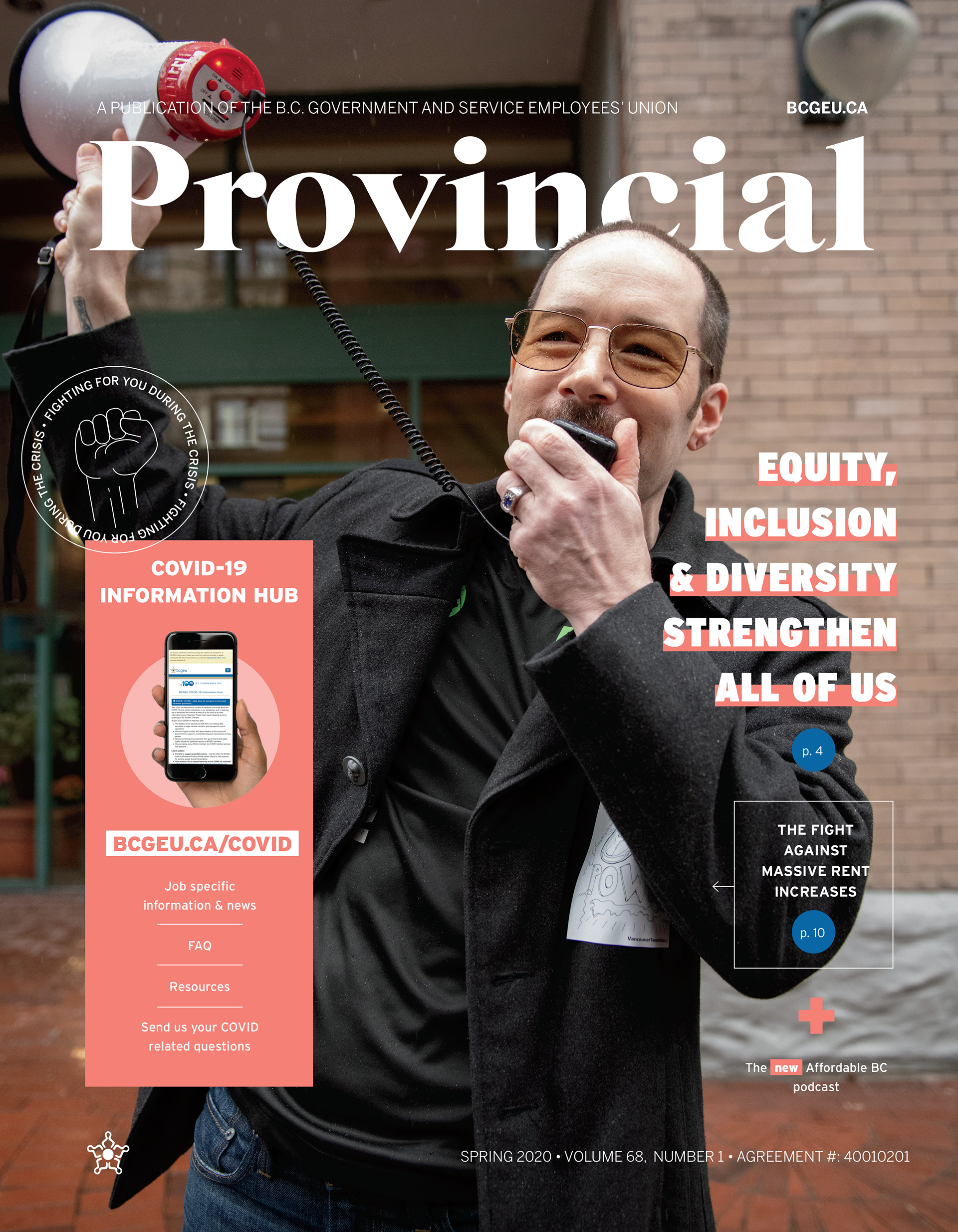
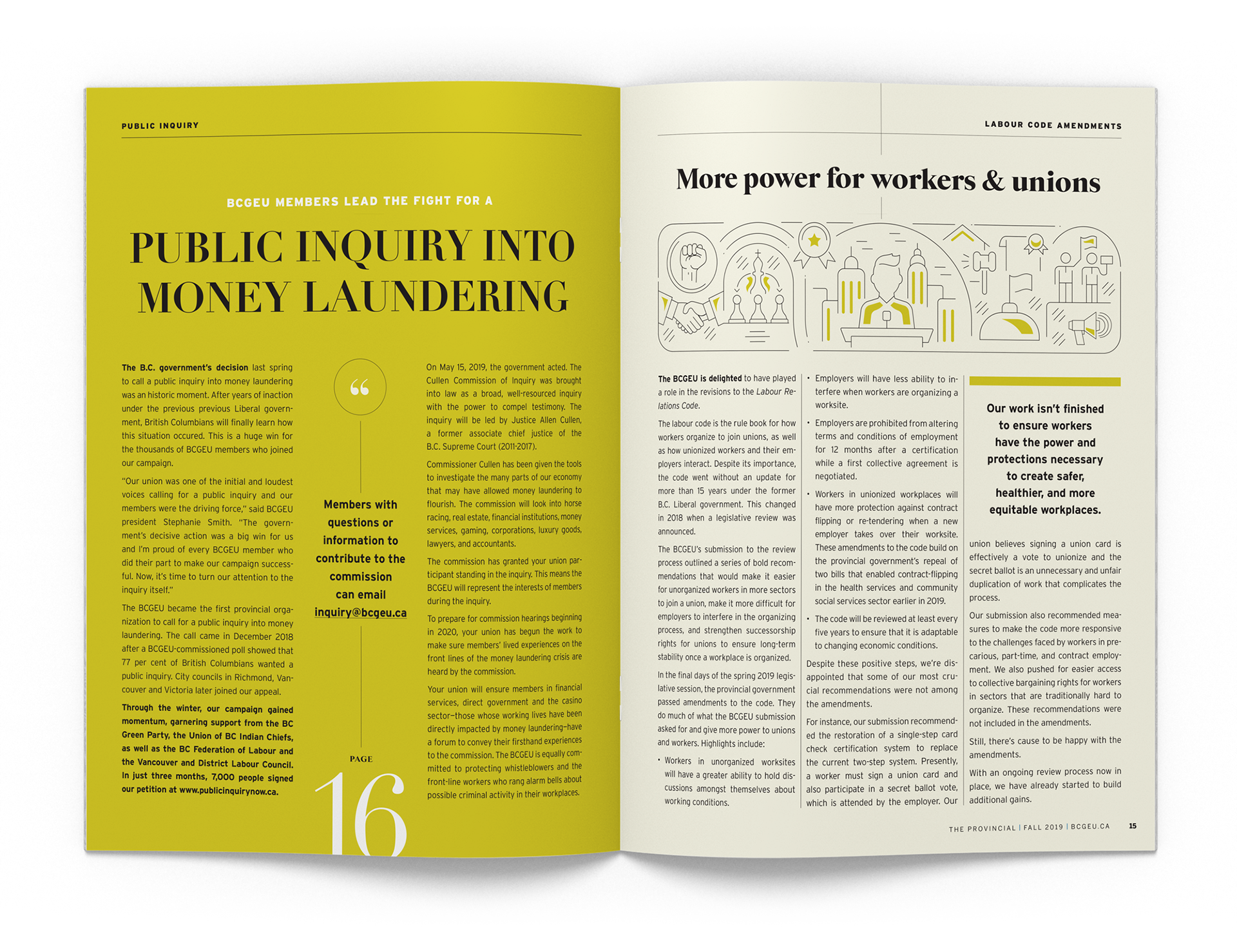
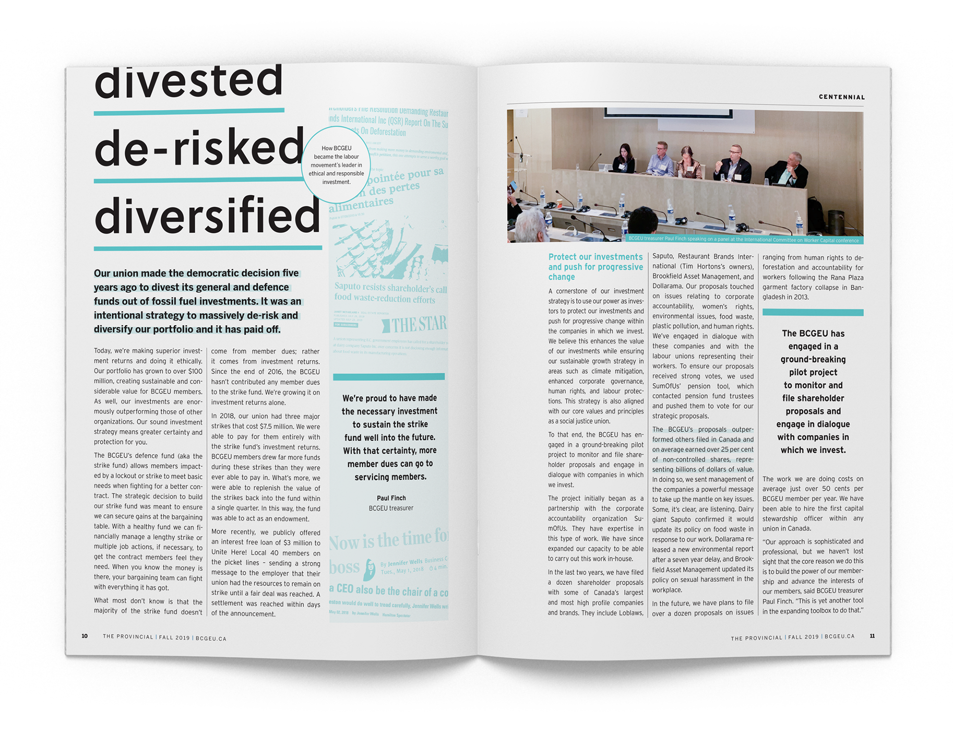
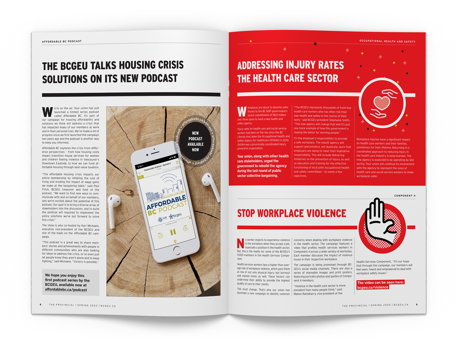
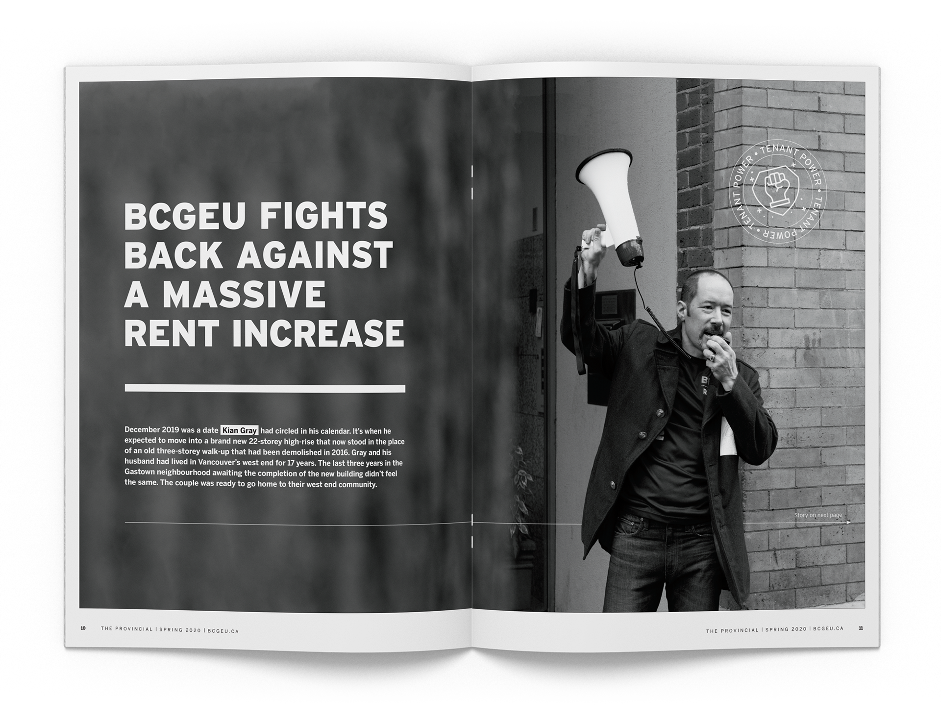
For the redesign of 'The Provincial,' I navigated the challenge of minimal photographic content by drawing inspiration from the visually dynamic layout of Fast Company. I shifted the magazine’s aesthetic to a lively interplay of custom doodles and bold typographic treatments, each page telling a story through its design. The articles are now framed by these elements, which guide the reader’s eye and engage their attention instead of traditional imagery. Member profiles are interspersed with photography I took, providing a genuine glimpse into the lives of union members. The cover shots, also my work, were carefully selected to resonate with the union’s ethos, each one setting the stage for the reader’s journey through the magazine’s newly invigorated pages.

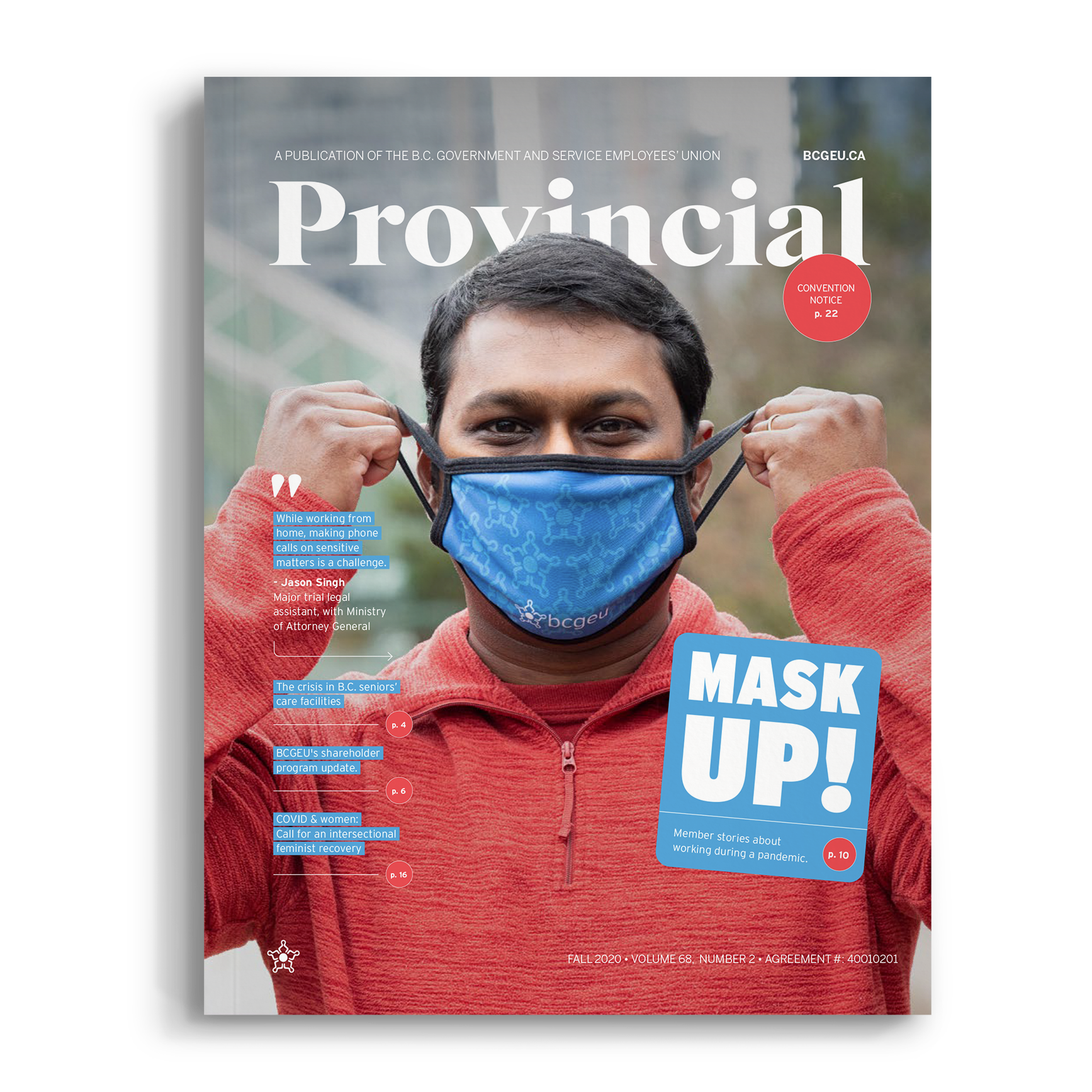


Cover Photography